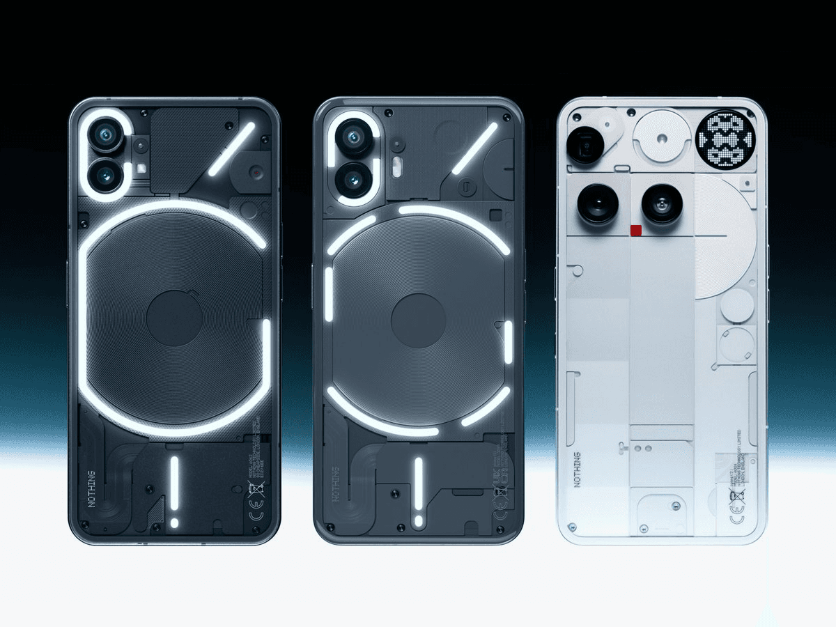
Nothing OS 3.0/ 4.0
Evolving core system experiences across two major OS generations.
Across Nothing OS 3.0 and 4.0, I led the evolution of several core system experiences, including the Lock Screen, Control Center and Essential Notifications.
Rather than treating each release as an isolated redesign, the work focused on building a more coherent system—improving everyday efficiency, expanding meaningful personalization and creating a stronger Nothing identity across different surfaces.
Scope of Work
- System UI
- Quick settings
- Lock screen
- Notification
OS Software
Building a more coherent system experience
Nothing OS already had a distinctive visual language, but visual difference alone was not enough.
As the system expanded, the challenge was to make its most frequently used surfaces feel more efficient, adaptable and connected.
Across Nothing OS 3.0 and 4.0, we gradually moved from fixed and isolated experiences toward a more modular system built around direct editing, user-controlled hierarchy and consistent interaction rules.
Lock screen
Evolving the Lock Screen into a more informative, editable and personal system surface.
Problem
Users wanted more information, shortcuts and personalization on the Lock Screen. However, simply adding more clocks, widgets and controls would make the interface increasingly crowded and weaken its role as a glanceable surface.
The challenge was to support richer content without turning the Lock Screen into a second Home Screen.
Direction
We introduced a modular structure that separated information, utility and personal expression into clear layers.
Users could directly edit the Lock Screen and decide which elements deserved attention, while system constraints preserved readability, visual balance and consistency across different wallpapers and screen states.
Feature scope
- Lock screen/ Clock face/ Widget / Shortcut customization
- Dynamic clock face
- Depth effect wallpaper
- AOD animation
- …
Quick settings
Transforming a fixed utility panel into a flexible system built around individual priorities.
Problem
The previous Quick settings used a largely fixed layout and gave different controls similar visual weight.
In reality, users relied on very different functions. Frequently used controls were not always easy to access, while less important controls occupied unnecessary space. The layout could not reflect individual habits or priorities.
Direction
We redesigned the Quick settings as a modular system with resizable controls, flexible arrangement and direct editing.
Different sizes represented different levels of importance and interaction, allowing users to organize the interface around their own habits while a controlled grid maintained clarity, alignment and system consistency.
Feature scope
- Free layout
- Different tile size
- Special tile
- New editing mode
- …
Essential notification
Helping users notice what matters without checking every notification.
Problem
Important messages were easily buried among promotional notifications, ordinary updates and other low-priority content.
Users were forced into a poor trade-off: allow constant interruption or reduce notifications and risk missing something important. The existing system managed notification volume, but did not clearly communicate priority.
Direction
We created a user-controlled priority system that allowed users to identify essential apps and conversations.
Important notifications received clearer treatment on the front screen, while the Glyph interface provided an ambient signal when the phone was face down. The system highlighted what mattered without exposing every notification or creating more noise.
Feature scope
- Notification UI update
- Hardware integration
- Icon customization
- …